What Makes a Good Website: Principles of Good Web Design (5 Top Examples)
No single aspect of Marketing is more important than a quality website. This is your organisation’s front door. A good website can break through. It can also convert users into engaged customers and brand ambassadors.
Thousands of pre-made templates and themes make creating a website easy. If all you want is a simple website that looks professional enough to give business a start.
But to differentiate in today’s competitive landscape, you need a website as unique as you are.
 Well Designed and Functional
Your site reflects your company. This shows your products and services. Most importantly, your brand. So it’s essential to be visually appealing.
- Keep it polished and professional.
- Allow white space to be seen.
- Include uncluttered layouts.
- Also focus on quality photographs and graphics.
This will allow your message to shine through.
Equally important, the site must work quickly and correctly. Always build to web standards and proofread rigorously. Also test regularly for problems with speed or functionality. Every page should always be fast and functional. This is because any visitor could be a customer’s first or only impression. Broken, slow, or poorly constructed areas are a big no. It will leave your visitors frustrated and encourage them to leave.

Simplicity
Simplicity is the best way to go. Especially when considering the user experience and the usability of your website. Below are ways to achieve simplicity through design:
Color has the power to dominate. It can communicate messages and evoke emotional responses. Finding a color palette that fits your brand is a priority. It will allow you to influence your customer’s behavior towards your brand. Keep the color selection limited to less than 5 colors. Complementary colors work very well. Pleasing color combinations increase customer engagement. This also makes the user feel good.
Sample: https://brushpic.com/professional-growth-systems/

F-Shaped Pattern Reading
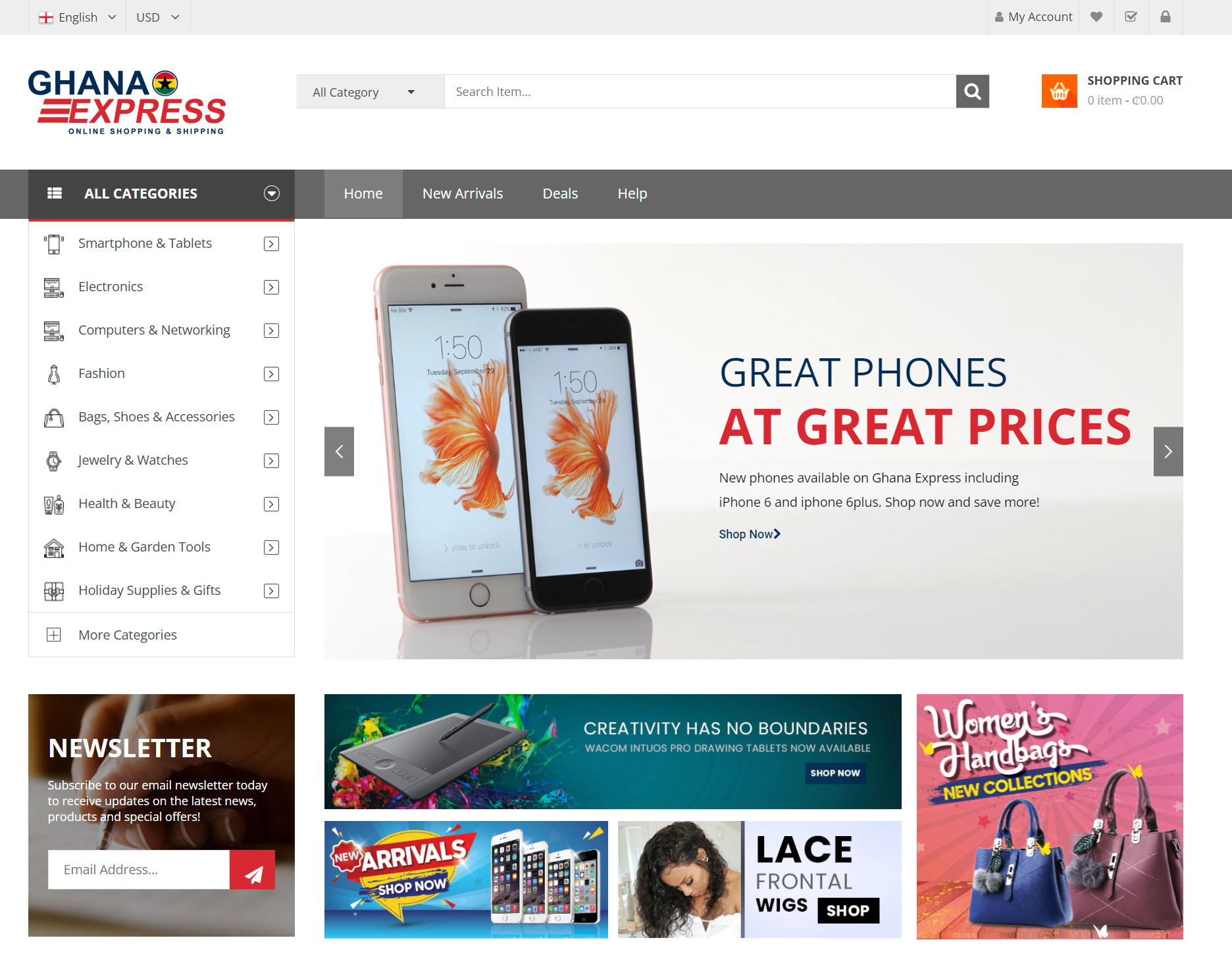
The F- based pattern is the most common way visitors scan on a website. Eye-tracking studies have found that most people see the top and left areas of the screen. The F shaped layout mimics our natural pattern of reading. Just like in the West: left to right and top to bottom. An effectively designed website will work with a reader’s natural pattern of scanning the page.
Sample: https://brushpic.com/ghana-express-brand-development/

Fresh and Quality Content
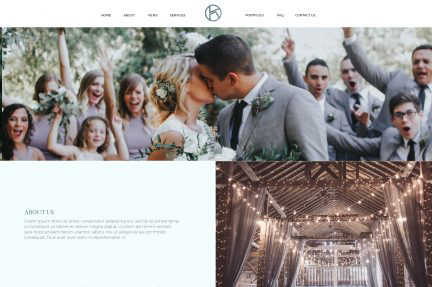
Be succinct. Always be interesting and new. Use language that makes sense to your audience. Avoid jargons. Do not include corporate speak and acronyms. Explain your “Why.” Visitors have short attention spans. So be sure to spell correctly. Be relevant and update regularly. Blogs and social media updates are great ways to add fresh content. This keeps visitors returning. It also helps SEO strategy. Yes, keeping things fresh requires a bit of investment. No, you can’t do without it.
Sample: https://brushpic.com/kendall-films/

Visual Hierarchy
Visual hierarchy is the arrangement of elements in order of importance. This is done through the following:
- Size
- Color
- Imagery
- Contrast
- Typography
- Whitespace
- Texture
- Style
One of the most important functions of visual hierarchy is to establish a focal point. This will show visitors where the most important information is.
Sample: https://brushpic.com/luau-blast-hot-sauce/
Our team will breathe life into your website and tell your story. We are a family of creative practitioners in the areas of design, marketing and technology. Send us a message to find out more!

